Project vitals are aptly named as they're some of the most important details about any project.
On September 30, 2022, we launched the long-awaited interface and experience changes to the Vitals panel. Instead of users accessing their vitals through a hover interaction within the page title, Vitals was moved into its own right-side panel that could be collapsed or expanded at the users' discretion.

The Feedback - Good, Bad, and the Ugly
We received more than 70 pieces of feedback within the first 24 hours of launching the feature. Most of the feedback was negative, which was expected, as with any significant interface change, people get the "who moved my cheese" moment. However, at Filevine, we want to, first and foremost, listen to our customers.

While some users found this experience useful and welcomed the change, we heard from others who preferred the previous location of the vitals. Whether it be due to screen size, the importance of the Tags, a need for the at-a-glance information, or just personal preference, we heard from many of you who felt the change could have been more suitable for your work in Filevine.

Moving Forward - Design for the User
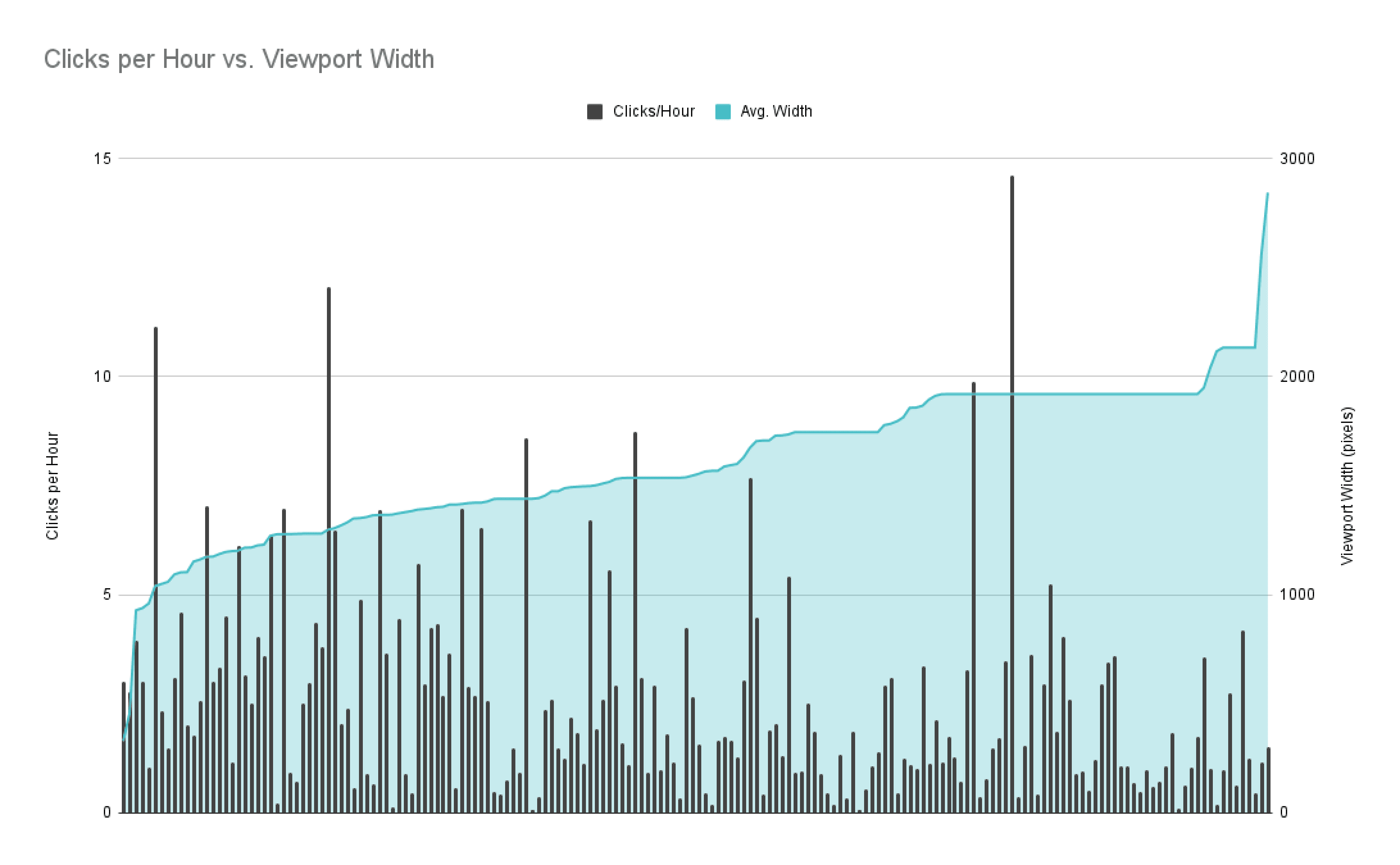
Proceeding with the feedback, we extensively researched to correct the problem and provide the best experience for our customers. We collected more feedback through Customer Satisfaction Surveys (CSAT) and our app, then looked at our usage data. This gave us a solid correlation to making some changes to correct the UI while providing us with some good direction on which to pivot.
Three core tenets for making changes to our user interface:
- Accessibility - making it accessible for all types of users; people using keyboard or mouse controls need to be able to access all functionality on the platform.
- Viewports - Users are on various screen sizes, from mobile to desktop, and providing users with wide screens to utilize their screen more fully was important.
- Vitals on-demand - our users have been adamant about having the vitals available at all times.
We began working on designs that would feel familiar to the previous vitals layout and working to gather feedback once again. During our research, we heard that even among peers, some liked the panel while some wanted the vitals at the top of every project, so we opted to allow for both options and let you choose how and when to see your vitals.
Today, you have two ways to view project vitals: in the Vitals Bar at the top of a project which shows all your Tags and the first five project details, or in the Vitals Panel, where you'll find all of the details.

A cornerstone of Filevine is the ability to customize it to suit how you work, and we're excited to launch this experience that lets you have more control over how you work. Thanks to all of you who provided us feedback and took the time to speak with us!
